Princeton University
Visual Arts Program
VIS 216, G-e-s-t-a-l-t
Tuesdays, 1:30–4:20 pm
Fall 2025
This course introduces students to techniques for decoding and creating graphic messages in a variety of media, and delves into issues related to visual literacy through the hands-on making and analysis of graphic form. Graphic design relies on mastering the subtle manipulation of abstract shapes and developing sensitivity to the relationships between them. Students are exposed to graphics from the late 19th-century to the present in slide lectures. Studio assignments and group critique will foster an individual ability to realize sophisticated forms and motivate these towards carrying specific meanings.
All work must be completed eloquently, precisely, and thoughtfully. Final grades are based on Exercises (10%), Assignment 1 (20%), Assignment 2 (10%), Assignment 3 (40%), and Class preparation / participation (20%). Each unexcused absence lowers the final grade by 5 points.
Print syllabus / Download readings
September 2, 2025
The snowflake problem
Resources
https://snowflakebentley.com
Exercise
Organizing snowflakes
The snowflake problem
Resources
https://snowflakebentley.com
Exercise
Organizing snowflakes
How to organize snowlakes is a problem [↓].
And this course will be organized around a series of problems like this one. These are visual problems, problems with more than one answer, cultural- and temporal- specific problems, problems which require both intuition *and* logic. These are graphic design problems.
This will be a course in graphic design and, more particularly, about visual form. We will look at triangles, Rubik’s cubes, musical melodies, arrows, traffic signs, trees, clock faces, old computer company logos, television stage sets, animated gifs, and we will ask: How does the specific shape of any given graphic shade the meaning we make from it when we see it? What does it mean to “read” an image? What would this graphic mean ten years ago? In another part of the world? Are some graphics more effective than others?
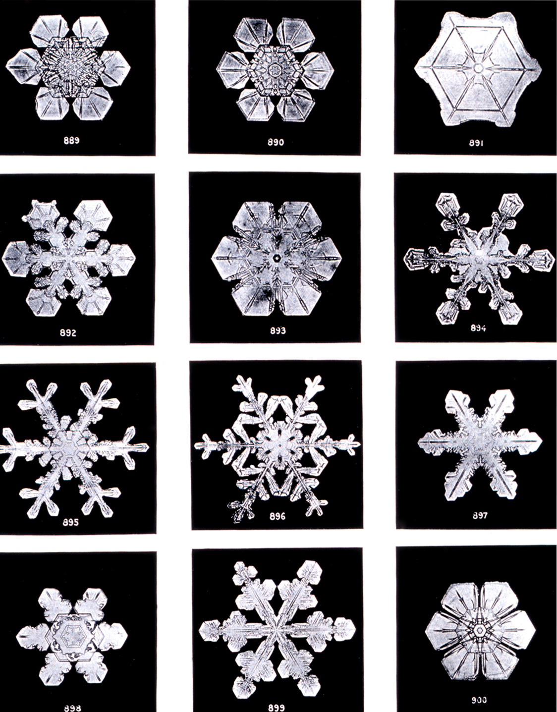
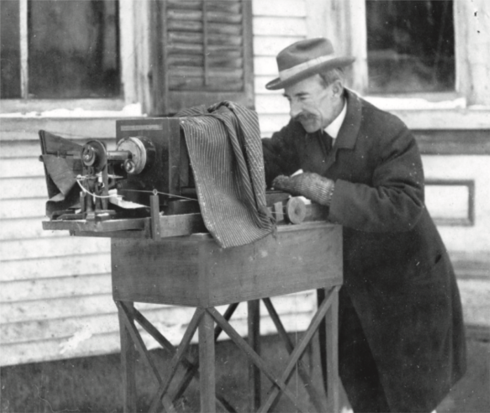
Wilson “Snowflake” Bentley was a farmer in the Northeast Kingdom of Vermont who on January 15, 1885, made the first ever photograph of a snow crystal by attaching his (rather bulky) camera to a microscope.
He described his motivation:
Snow Crystals is still widely available in print. And it is extraordinary — collecting his meticulous photographs in three-by-four grids, page after page of individual snowflakes. You can see that the grids are organized formally, with photographs that look like each other placed near each other.
Continues in class . . .
And this course will be organized around a series of problems like this one. These are visual problems, problems with more than one answer, cultural- and temporal- specific problems, problems which require both intuition *and* logic. These are graphic design problems.
This will be a course in graphic design and, more particularly, about visual form. We will look at triangles, Rubik’s cubes, musical melodies, arrows, traffic signs, trees, clock faces, old computer company logos, television stage sets, animated gifs, and we will ask: How does the specific shape of any given graphic shade the meaning we make from it when we see it? What does it mean to “read” an image? What would this graphic mean ten years ago? In another part of the world? Are some graphics more effective than others?
Wilson “Snowflake” Bentley was a farmer in the Northeast Kingdom of Vermont who on January 15, 1885, made the first ever photograph of a snow crystal by attaching his (rather bulky) camera to a microscope.
He described his motivation:
Under the microscope, I found that snowflakes were miracles of beauty; and it seemed a shame that this beauty should not be seen and appreciated by others. Every crystal was a masterpiece of design and no one design was ever repeated. When a snowflake melted, that design was forever lost.Over the next forty-four years, Bentley photographed 5,000 more, no two exactly the same. In November 1931, McGraw/Hill published Snow Crystals. He passed away one month later.
Snow Crystals is still widely available in print. And it is extraordinary — collecting his meticulous photographs in three-by-four grids, page after page of individual snowflakes. You can see that the grids are organized formally, with photographs that look like each other placed near each other.
Continues in class . . .
September 9, 2025
Introduction
Reading
Investigations-on-Gestalt-Principles.pdf (Max Wertheimer)
Resources
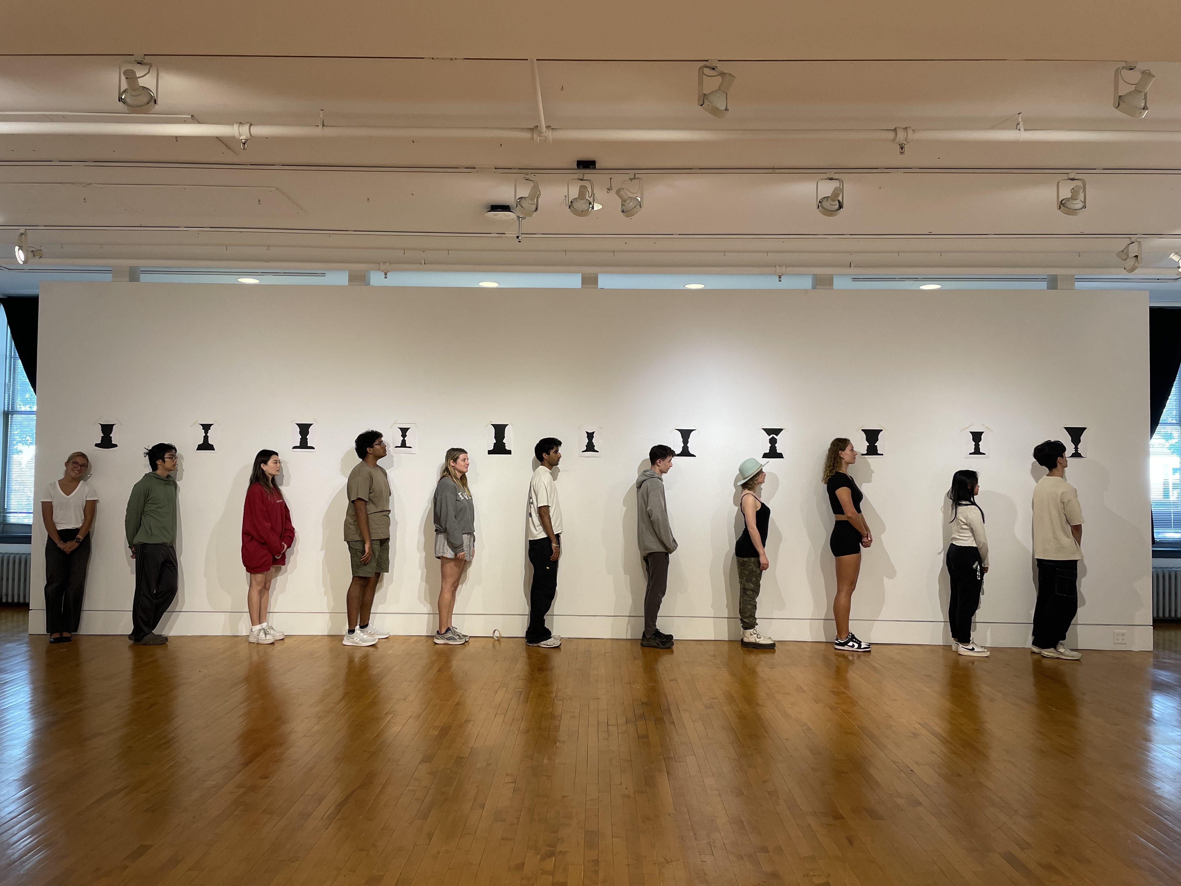
https://en.wikipedia.org/wiki/Rubin_vase
Art-Design-and-Gestalt-Theory.pdf (Roy Behrens)
Some vases and some faces
Exercise
Vase / Face
Field Trip
New York Art Book Fair
Introduction
Reading
Investigations-on-Gestalt-Principles.pdf (Max Wertheimer)
Resources
https://en.wikipedia.org/wiki/Rubin_vase
Art-Design-and-Gestalt-Theory.pdf (Roy Behrens)
Some vases and some faces
Exercise
Vase / Face
Field Trip
New York Art Book Fair
So, it starts like this:

And what a remarkable process it is when some other mode of apprehension does succeed. I gaze for a long time from my window, adopt after some effort the most unreal attitude possible, and I discover that part of the window sash and part of a bare branch together compose an “N.” Or look at a picture.


Continues in class . . .
I stand at the window and see a house, trees, sky. Theoretically I might say there were 327 brightnesses and nuances of color. Do I have 327? No, I have sky, house, and trees. It’s impossible to achieve 327 as such. And yet even though such droll calculation were possible and implied—say for the House, 120, the trees, 90, the sky, 117—I should at least have this arrangement and division of the total not say 127 and 100 or 150 and 177. The concrete division which I see is not determined by some arbitrary mode of organization lying solely within my own pleasure. Instead I see the arrangement and division which is given there before me [↙].
And what a remarkable process it is when some other mode of apprehension does succeed. I gaze for a long time from my window, adopt after some effort the most unreal attitude possible, and I discover that part of the window sash and part of a bare branch together compose an “N.” Or look at a picture.
Two faces cheek-to-cheek [↑]. I see one with its, if you will, 57 brightnesses and the other 49 brightnesses. I did not see an arrangement of 66 plus 40 nor 6 plus 100. There have been theories which would require I see 106. In reality I see two faces. Or I hear a melody, 17 tones with its accompaniment, 32 tones. I hear the melody and accompaniment not simply 49 and certainly not 20 plus 20 plus 9. And the same is true even in cases where there is no stimulus continuum. I hear the melody.
Or one sees a series of discontinuous dots [↑] upon a homogenous ground, not as the sum of dots, but as figures. Even though there may have been a greater latitude of possible arrangements the dots usually combine in some spontaneous, natural articulation and any other arrangement even if it can be achieved is artificial and difficult to maintain. When we are presented with a number of stimuli we do not as a rule experience a number of individual things—this one and that. Instead larger holes separated from and related to one another are given an experience. Their arrangement and division are concrete and definite.This is an excerpt from what’s known as the “Dot Essay” from 1923, written by Czech psychologist Max Wertheimer, and more accurately known as ”Investigations in Gestalt Principles,” or “Laws of Organization in Perceptual Forms.” It’s a strange text that shifts between letters and dots. The dots assemble and reassemble into constellations that read more like sentences—initiating, picking up, or expanding on an idea. Although the text is didactic and intended to be instructive, it has a restive quality. Since it is performing the subject matter that it’s also attempting to explain, it’s hard to make it stay still. And through its shifting nature, the text articulates the fundamental Gestalt qualities, which describe how distinct groupings of the same dots can be seen to be related to one another.
Continues in class . . .
September 16, 2025
A Plea for More Symbols
Reading
Symbols.pdf (David Gibbs)
Resources
Symbol Sourcebook (Henry Dreyfuss)
Illusions-and-Brain-Models.pdf (R.L. Gregory)
Assignment
#1 Stop (starts)
A Plea for More Symbols
Reading
Symbols.pdf (David Gibbs)
Resources
Symbol Sourcebook (Henry Dreyfuss)
Illusions-and-Brain-Models.pdf (R.L. Gregory)
Assignment
#1 Stop (starts)
On the opening pages of Symbol Sourcebook from 1972, industrial designer Henry Dreyfuss made a direct appeal to the reader:
Perhaps this looks at first like it might be on the way to being a universal symbol for something, but, as we will see, it clearly is not. Nonetheless, this book is a valuable archive. Page after page, the sourcebook collects and organizes graphic symbols (I spy the g-e-s-t-a-l-t spiral!):
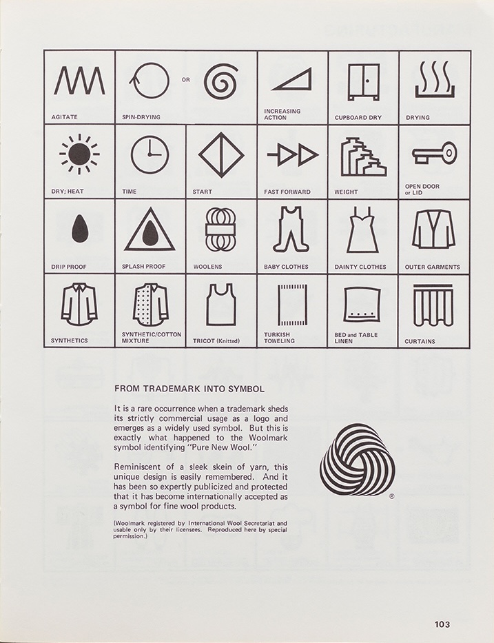
Meanwhile, why we wait for the symbol archive, we are going to add a few of our own.
Continues in class . . .
A PLEA FOR MORE SYMBOLS
My interest in symbols is a continuing one. I hope that the countless people and organizations who have already contributed information will continue to do so, and that they will be joined by new enthusiasts who are introduced to the importance of symbols through this Sourcebook.
One day a central symbol archive surely will be established, in which all symbols used throughout the world will be catalogued and available for reference. Looking toward this goal, we are keeping our Data Bank active and open for further contributions - which indeed will be welcomed. Information may be sent to the author, P.O. Box 70, South Pasadena, California, 91030This universal symbol archive is not yet available (although perhaps the internet is approaching that as a limit). Meanwhile, David Gibbs identifies some confusion which is getting in the way of this comprehensive goal:
What is meant by the word 'symbol' here needs some defining. This presents problems, because the definition has changed over the last century and continues to do so. One reason for this is the lax and relatively recent interchangeability of the terms 'symbol' and 'logo,' which has been and still is confusing. Design is a business where the latest buzzwords can be embraced without too much thought being given to the consequences. So it was with 'logo' when it first entered the language in the 1930s as a cute and fashionable short form of 'logotype.The trick (well, one among many) is that symbols are anything *but* universal. A symbol is merely graphic shorthand for an idea, a visual-linguistic convention — it means what it means only because we agree that it does. These meanings shift in cultural context, temporal context, visual context, and so on. Here is one symbol in the process of becoming from Dreyfuss's book [↓]:
Perhaps this looks at first like it might be on the way to being a universal symbol for something, but, as we will see, it clearly is not. Nonetheless, this book is a valuable archive. Page after page, the sourcebook collects and organizes graphic symbols (I spy the g-e-s-t-a-l-t spiral!):
Meanwhile, why we wait for the symbol archive, we are going to add a few of our own.
Continues in class . . .
September 23, 2025
A Few Forms
Reading
Function-and-Gestalt.pdf (Max Bill)
Continuity-and-Change.pdf (Max Bill)
Resources
Ulm School
The Ulm Model
Assignment
#1 Stop (continues)
A Few Forms
Reading
Function-and-Gestalt.pdf (Max Bill)
Continuity-and-Change.pdf (Max Bill)
Resources
Ulm School
The Ulm Model
Assignment
#1 Stop (continues)

Here’s Max Bill. He’s drawing some remarkably neat circles on the chalkboard. This image gives me some—perhaps false—insight into Bill’s character, as someone who would be able to draw such a precise circle again and again on the chalkboard in overlapping configurations. Bill was born in 1908, in Switzerland, and studied architecture. He identified as an architect and, in fact, designed many buildings, but he was also a graphic designer. He was also an industrial designer. He was also an artist and a teacher and a writer. Bill was a generalist who didn’t make crisp distinctions between design practices—he let the projects and the work lead. I like that aspect of his practice. Here’s Bill sitting at his drafting table with a pair of French curves, designing a spoon:

And here he’s working on a sculpture.

His sculptures were often commissioned for public spaces and took the shape of three-dimensional, complex geometric forms, like Möbius strips, modified spheres, Klein bottles, and other gestalt forms. Bill was a modernist, meaning that he adopted a brand-new visual vocabulary that was in step with the way the world was changing around him; he had a desire for new forms that addressed new problems, never defaulting to what existed previously, but rather reinventing each time, obeying poet Ezra Pound’s ur-modernist command to “make it new.”
Continues in class . . .
September 30, 2025
The Language of Visual Thinking
Reading
A-Plea-for-Visual-Thinking.pdf (Rudolph Arnheim)
Language-of-Vision-Kepes.pdf (Gyorgy Kepes)
Resources
https://en.wikipedia.org/wiki/Visual_thinking
Assignment
#1 Stop (adjusted)
The Language of Visual Thinking
Reading
A-Plea-for-Visual-Thinking.pdf (Rudolph Arnheim)
Language-of-Vision-Kepes.pdf (Gyorgy Kepes)
Resources
https://en.wikipedia.org/wiki/Visual_thinking
Assignment
#1 Stop (adjusted)
Rudolf Arnheim was a German who emigrated to the United States during World War II. He studied psychology at the University of Berlin under Max Wertheimer and Wolfgang Köhler. At the time Max Planck and Albert Einstein were also teaching at the school, so it was a rich moment. Psychology was part of the Department of Philosophy, and the Psychological Institute at the University of Berlin was housed on two expansive floors of the Imperial Palace. The ad hoc situation provided plenty of room for the students to setup and conduct experiments on each other. Much of the interest around the Institute was in Gestalt psychology and perception, and Arnheim was drawn to all of this.
He was also interested in art and personal expression, and when he left school he began to bring the lessons of Gestalt psychology directly into the fields of art and design at schools like Sarah Lawrence College, Harvard University, and the University of Michigan, where he taught psychology and wrote about art.
Arnheim published several books which translated Gestalt psychology for the world of art and design, two of which are well-known. The first, Art and Visual Perception (1954), has been translated into 14 languages and remains one of the most consequential art books of the 20th century. The second was a bit less of a publishing juggernaut—Visual Thinking (1969) [↘].

As the title suggests, it wrestles with the differences between perceiving and thinking, suggesting that they are the same thing. Arnheim writes,
Continues in class . . .
He was also interested in art and personal expression, and when he left school he began to bring the lessons of Gestalt psychology directly into the fields of art and design at schools like Sarah Lawrence College, Harvard University, and the University of Michigan, where he taught psychology and wrote about art.
Arnheim published several books which translated Gestalt psychology for the world of art and design, two of which are well-known. The first, Art and Visual Perception (1954), has been translated into 14 languages and remains one of the most consequential art books of the 20th century. The second was a bit less of a publishing juggernaut—Visual Thinking (1969) [↘].
As the title suggests, it wrestles with the differences between perceiving and thinking, suggesting that they are the same thing. Arnheim writes,
Thinking, productive thinking, should happen in images.That’s visual thinking—a different kind of thinking that uses the spatial capacities of your brain to think in images and solve problems intuitively. Arnheim lays out a series of visual thinking exercises in the text by which picturing a model in your mind’s eye helps to reveal parts of a problem that would not be so easily described otherwise. In one, Arnheim asks the reader to imagine a 3 × 3 × 3 cube composed of 27 individual cubes. (Basically, it’s a Rubik’s cube.) The cube is painted red on all sides. Now, picture the cube, turn it around, have a look and a think. How many cubes that make up that composite cube have zero sides colored red?
Continues in class . . .
October 7, 2025
Currently in Process
Reading
Interaction-of-Color.pdf (Josef Albers)
Resources
A-Primer-of-Visual-Literacy.pdf (Donis A. Dondis)
https://www.metmuseum.org/art/collection/search/489056
https://helpx.adobe.com/photoshop/how-to/create-animated-gif.html
Assignment
#2 Wait (starts)
Currently in Process
Reading
Interaction-of-Color.pdf (Josef Albers)
Resources
A-Primer-of-Visual-Literacy.pdf (Donis A. Dondis)
https://www.metmuseum.org/art/collection/search/489056
https://helpx.adobe.com/photoshop/how-to/create-animated-gif.html
Assignment
#2 Wait (starts)
This is A Primer of Visual Literacy [↓].

This graphic design textbook was written by Donis A. Dondis, published by MIT Press in 1973, and is currently in its 23rd printing. It was designed by Muriel Cooper. Cooper and Dondis were classmates at Massachusetts College of Art in the 1950s and remained friends.
When the book was written, Dondis was teaching graphic design at Boston University in the School of Public Communication and Cooper was design director at MIT Press. (She would soon start teaching in the Department of Architecture.) The book evolved from a running conversation between the two around teaching graphic design in the context of massive changes to the media landscape. The book proposed that in an age of mass electronic visual communication (such as television), reading and writing images was as fundamental as reading and writing words. Dondis ends the first chapter describing what’s at stake:
The proximity of author and designer and their shared investment in the contents led to a subtly strange layout. The book’s typography is slightly off and feels automated, with a uniformly light Univers type, consistently awkward letterspacing, and affectations such as underlines in place of italics. Turns out that the typography was a consequence of its production. At the time Muriel Cooper had set up a research unit in the basement of the MIT Press offices and was exploring the application of electric and electronic typewriters to produce camera-ready typography. This book was set on an (only) slightly more advanced system, the IBM Electronic Composer which allowed for variable-spaced typesetting in a wider range of types. The great advantage was that layouts could be created completely in-house and this resulted in a more iterative design and editing process. The disadvantage was the quality of the typesetting. This is also part of what gives the book a visual spark [↓].

When I’ve used this book in teaching (which is often), I ask students: Why does the cover look like it does? It looks to me like writing, or some kind of coded message. What does it say?
Continues in class . . .
This graphic design textbook was written by Donis A. Dondis, published by MIT Press in 1973, and is currently in its 23rd printing. It was designed by Muriel Cooper. Cooper and Dondis were classmates at Massachusetts College of Art in the 1950s and remained friends.
When the book was written, Dondis was teaching graphic design at Boston University in the School of Public Communication and Cooper was design director at MIT Press. (She would soon start teaching in the Department of Architecture.) The book evolved from a running conversation between the two around teaching graphic design in the context of massive changes to the media landscape. The book proposed that in an age of mass electronic visual communication (such as television), reading and writing images was as fundamental as reading and writing words. Dondis ends the first chapter describing what’s at stake:
What you see is a major part of what you know, and visual literacy can help us to see what we see and to know what we know.The book presents itself as a kind of extended slide lecture, or a series of lectures marked off as chapters; running texts interjected with demonstration images, in-line illustrations that work like projected illustrations. The book’s pacing is deliberate and the tone is solidly didactic and incremental. Reading it feels like sitting in a classroom, in a good way.
The proximity of author and designer and their shared investment in the contents led to a subtly strange layout. The book’s typography is slightly off and feels automated, with a uniformly light Univers type, consistently awkward letterspacing, and affectations such as underlines in place of italics. Turns out that the typography was a consequence of its production. At the time Muriel Cooper had set up a research unit in the basement of the MIT Press offices and was exploring the application of electric and electronic typewriters to produce camera-ready typography. This book was set on an (only) slightly more advanced system, the IBM Electronic Composer which allowed for variable-spaced typesetting in a wider range of types. The great advantage was that layouts could be created completely in-house and this resulted in a more iterative design and editing process. The disadvantage was the quality of the typesetting. This is also part of what gives the book a visual spark [↓].
When I’ve used this book in teaching (which is often), I ask students: Why does the cover look like it does? It looks to me like writing, or some kind of coded message. What does it say?
Continues in class . . .
October 21, 2025
Amazing Grace
Resources
https://www.npr.org/2018/11/14/667440842/aretha-franklin-touches-the-infinite-in-the-long-delayed-film-amazing-grace
https://www.youtube.com/watch?v=IN05jVNBs64
Karel Martens, Unbound, Stedlijk Museum (Amsterdam)
Karel Martens, Unbound, Stedlijk Museum (Amsterdam) video
Karel Martens 30 km/h street painting
Karel Martens 30 km/h street painting (more)
Karel Martens 30 km/h street painting (interview)
Experimental Jetset
Experimental Jetset (Whitney)
Experimental Jetset (Lost Formats Preservation Society)
Exercise
What does “Amazing Grace” look like?
I've been wondering about something for a good while now, and I still don’t have a convincing answer. Perhaps you can all help.

Last summer I saw a movie I loved. Amazing Grace was compiled from previously unreleased footage of the staging of a live concert album by Aretha Franklin of the same name in 1972. The album was recorded over the course of two nights in January at Watts’ New Temple Missionary Baptist Church in south central Los Angeles. At the time, Frankin was a very well known pop star, with 11 consecutive No. 1 songs, 5 Grammys, and more than 20 albums. This live recording session marked a return to her gospel roots in the church. Each evening was attended by a select audience and looking around you can see including gospel legend Clara Ward and Rolling Stones’ frontman Mick Jagger. Anyway, it was very clear this was a very big event.
And so Warner Bros. Records hired young and just Oscar-nominated director Sydney Pollack to shoot the sessions. Pollack forgot to mark to use clapper boards to mark in an out points of the film and keep the audio in sync with the video. As a result, much of the footage was useless and the film remained unreleased, in musical cultural purgatory for 46 years. (If we’re lucky, we will screen the entire film in class, with the volume as loud as possible.)

The high point of the film arrives when Frankin performs the title song “Amazing Grace.” It is an old tune. Christian congregations sang it at least since 1779 and perhaps earlier. And it is just one of those songs that is instantly familiar, recognizable in all of its various forms. Aretha Franklin sang it in 1972. Bruce Springsteen played the tune on harmonica in Greensboro, North Carolina in 1985. Barack Obama sang it in Charleston at a funeral in 2015. Bruce Springsteen and Barack Obama talked about Obama’s version in 2021. Aretha Franklin sang it for Barack Obama at the White House. Jennifer Hudson sang it at Aretha Franklin's funeral. And now Jennifer Hudson, playing Aretha Franklin in an upcoming film, will sing it while pretending to be Aretha. Of course the song has been sung so many places, in so many ways, by so many different people.
Then how in the world do we always still recognize this simple tune?
Continues in class . . .
How do we recognize a melody?How do we keep a discontinuous set of discrete musical pitches, played out over time, hitting our brains at different moments, organized as one “thing?” A musical line, a melody, a tune? And further, how is it that we can recognize a certain melody even when it is bent and twisted, played by another instrument, or in another key, sung by a different voice, at a different volume, at a different rhthym, and at a different point in time? Surely there is mechanism that explains how our brains keep track of all this information, and surely there are tricks for recalling a certain sequence of notes. It also must be true (given firsthand and common experience) that some tunes are simply *stickier* and therefore, easier to remember. Are some melodies stronger or more coherent than others? How would we even know?
Last summer I saw a movie I loved. Amazing Grace was compiled from previously unreleased footage of the staging of a live concert album by Aretha Franklin of the same name in 1972. The album was recorded over the course of two nights in January at Watts’ New Temple Missionary Baptist Church in south central Los Angeles. At the time, Frankin was a very well known pop star, with 11 consecutive No. 1 songs, 5 Grammys, and more than 20 albums. This live recording session marked a return to her gospel roots in the church. Each evening was attended by a select audience and looking around you can see including gospel legend Clara Ward and Rolling Stones’ frontman Mick Jagger. Anyway, it was very clear this was a very big event.
And so Warner Bros. Records hired young and just Oscar-nominated director Sydney Pollack to shoot the sessions. Pollack forgot to mark to use clapper boards to mark in an out points of the film and keep the audio in sync with the video. As a result, much of the footage was useless and the film remained unreleased, in musical cultural purgatory for 46 years. (If we’re lucky, we will screen the entire film in class, with the volume as loud as possible.)
The high point of the film arrives when Frankin performs the title song “Amazing Grace.” It is an old tune. Christian congregations sang it at least since 1779 and perhaps earlier. And it is just one of those songs that is instantly familiar, recognizable in all of its various forms. Aretha Franklin sang it in 1972. Bruce Springsteen played the tune on harmonica in Greensboro, North Carolina in 1985. Barack Obama sang it in Charleston at a funeral in 2015. Bruce Springsteen and Barack Obama talked about Obama’s version in 2021. Aretha Franklin sang it for Barack Obama at the White House. Jennifer Hudson sang it at Aretha Franklin's funeral. And now Jennifer Hudson, playing Aretha Franklin in an upcoming film, will sing it while pretending to be Aretha. Of course the song has been sung so many places, in so many ways, by so many different people.
Then how in the world do we always still recognize this simple tune?
Continues in class . . .
October 28, 2025
Chasing Arrows
Reading
Chasing-Arrows.pdf (New York Times)
The Universal Recycling Symbol (BBC Witness History)
Waste Land (NPR Planet Money)
Resources
Debunking-the-Recycling-Myth-Starting-with-Its-Symbol.pdf (New York Times)
Assignment
#3 Reduce, Reuse, Recycle
Events
https://t-y-p-o-g-r-a-p-h-y.org/november-3
Nazlı Ercan
Bryce Wilner
Matt Wolff
Griffin Lecture
Sonnenzimmer
There’s something funny about this symbol:

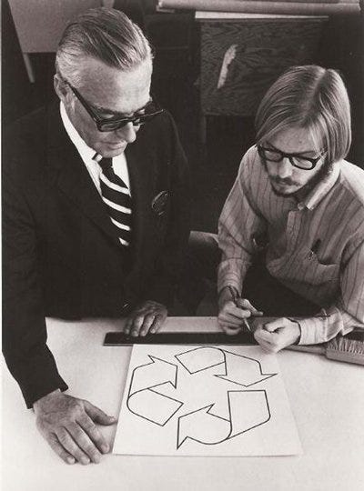
You’ve seen it a million times, appearing on cardboard milk containers, on aluminum cans, on yogurt containers, or shampoo bottles. The well-known mark was originally designed by Gary Anderson, a 23-year-old University of Southern California architecture student for a design competition to mark recycled paper products. The competition was launched by Container Corporation of America to mark the first Earth Day. Anderson submitted three entries as a step-wise refinement of his simple, and strong graphic idea of three arrows chasing each other in an endless loop.
Container Corporation of America, at the time, was a powerful proponent and commissioner of modern graphic design. The jury for the competition included some of the most celebrated designers of that moment including Herbert Bayer, Elliot Noyes, and Saul Bass. The jurors awarded Anderson’s entry as the winner, selecting his third and simplest drawing.
In a 2023 BBC interview, Gary Anderson recalled what inspired his idea:

Continues in class . . .
You’ve seen it a million times, appearing on cardboard milk containers, on aluminum cans, on yogurt containers, or shampoo bottles. The well-known mark was originally designed by Gary Anderson, a 23-year-old University of Southern California architecture student for a design competition to mark recycled paper products. The competition was launched by Container Corporation of America to mark the first Earth Day. Anderson submitted three entries as a step-wise refinement of his simple, and strong graphic idea of three arrows chasing each other in an endless loop.
Container Corporation of America, at the time, was a powerful proponent and commissioner of modern graphic design. The jury for the competition included some of the most celebrated designers of that moment including Herbert Bayer, Elliot Noyes, and Saul Bass. The jurors awarded Anderson’s entry as the winner, selecting his third and simplest drawing.
In a 2023 BBC interview, Gary Anderson recalled what inspired his idea:
And so I took that idea which is that one end of a strip is flipped over and attached to the other end of a strip, there is really only one surface. In my mind that kind of related to recycling, because if everything is recycled then it just seems like we are reusing the same material over and over again.What he imagined was a Moebius Strip, a topological curiosity that you are all likely familiar with which produced a closed and continuous figure with only one side. It is a dimensional absurdity that had fascinated Anderson for years.
Continues in class . . .
November 4, 2025
An Inconvenient Truth
Resources
mgmt design
An Inconvenient Truth (book)
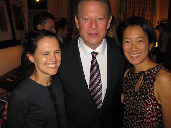
Al, Alicia, Sarah
Assignment
#3 Reduce, Reuse, Recycle (continues)
An Inconvenient Truth
Resources
mgmt design
An Inconvenient Truth (book)
Al, Alicia, Sarah
Assignment
#3 Reduce, Reuse, Recycle (continues)
Once upon a time, there was a movie based on a Keynote slide show, delivered by a former Vice President, with animated graphics and copious warnings. It was riveting and It was terrifying, although evidently not nearly terrifying enough. Anyway, all of this was likely before you were born.
Here’s Al Gore in An Inconvenient Truth from 2006:

Near the start of the film, he self-deprecatingly introduces himself:
The movie was a particular hybrid, starting with Gore shuffling Keynote slides on his laptop and proceeding to document the slide show performance he has delivered more than 1000 times since all over the world to state the obvious case for climate action. Wikipedia classifies the movie a “concert film.” It even won an Oscar. Also in 2006, the film became a book, designed in New York City by mgmt design, and available all over the world since.

Continues in class . . .
Here’s Al Gore in An Inconvenient Truth from 2006:
Near the start of the film, he self-deprecatingly introduces himself:
I am Al Gore. I used to be the next President of the United States.Immediately the stakes are clear and the slim margins that kept him out of the Presidency suddenly feels like a planetary-scale disaster. What corrections, what legislation, what common sense might he have been able to enact from the Oval Office?
The movie was a particular hybrid, starting with Gore shuffling Keynote slides on his laptop and proceeding to document the slide show performance he has delivered more than 1000 times since all over the world to state the obvious case for climate action. Wikipedia classifies the movie a “concert film.” It even won an Oscar. Also in 2006, the film became a book, designed in New York City by mgmt design, and available all over the world since.
Continues in class . . .
November 11, 2025
After Effects
Reading
A-Language-of-Signs-and-Symbols.pdf (Bruno Munari)
The-Triangle.pdf (Bruno Munari)
Resources
http://www.munart.org
Assignment
#3 Reduce, Reuse, Recycle (continues)
After Effects
Reading
A-Language-of-Signs-and-Symbols.pdf (Bruno Munari)
The-Triangle.pdf (Bruno Munari)
Resources
http://www.munart.org
Assignment
#3 Reduce, Reuse, Recycle (continues)
I like to talk about Italian artist and designer Bruno Munari, hold him up as a model, because of the general nature of his practice, which ignored boundaries between the various kinds of work he was engaged in. Munari made graphic design, sculptures, paintings, exhibitions. He lectured, he taught, and he wrote. In one text from about 1964, “A Language of Signs and Symbols?”, Munari offers up his own primer
on visual literacy, although typically, it has his touch of the absurd. Like Dondis, Munari is describing coherent sets of symbols with grammar, vocabulary, structure. These include electrical schematics, road signs, and hobo symbols [↓].
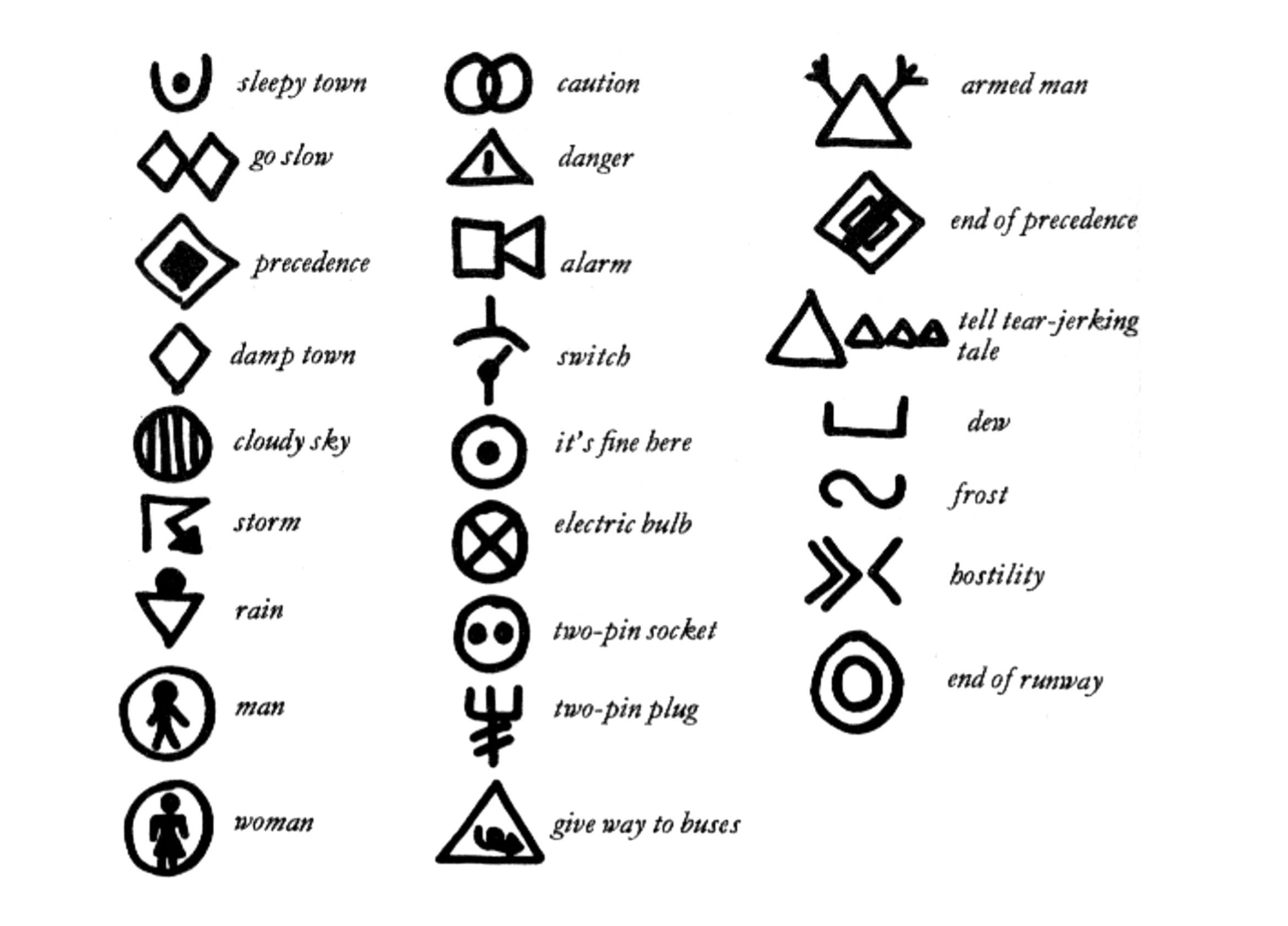
Hobo symbols are used to mark places, for example, along a freight train route, to indicate what may or may not be available in a town or area or what kind of people and reception to expect somewhere—helpful tips for the next traveler. The top left one is a sleepy town. The two diamonds next to each other indicate “go slow.” One that actually looks like what it means is the armed man. The triangle actually looks terrified. The bent arrow for a storm is an interesting choice. Look at the symbol for hostility; that would be a hard assignment. These are icons that might be written along a well-worn hobo route, on train cars, or on a fence. They were meant to be read only by this self-selected group (tramps, hobos, vagabonds) that has decided to live this way and to adopt this visual language.
Symbols could be combined. For example, here [↙] we see armed man plus fierce dog. And then this one [↘], which looks like a face and it combines symbols from three sets to convey its message: “I am in a narrow place between rain and snow, please help.”

This work is typical Munari—it is funny, it’s curious, it’s synthetic, and it’s visual. He’d have called it “design research.”
Continues in class . . .
on visual literacy, although typically, it has his touch of the absurd. Like Dondis, Munari is describing coherent sets of symbols with grammar, vocabulary, structure. These include electrical schematics, road signs, and hobo symbols [↓].
Hobo symbols are used to mark places, for example, along a freight train route, to indicate what may or may not be available in a town or area or what kind of people and reception to expect somewhere—helpful tips for the next traveler. The top left one is a sleepy town. The two diamonds next to each other indicate “go slow.” One that actually looks like what it means is the armed man. The triangle actually looks terrified. The bent arrow for a storm is an interesting choice. Look at the symbol for hostility; that would be a hard assignment. These are icons that might be written along a well-worn hobo route, on train cars, or on a fence. They were meant to be read only by this self-selected group (tramps, hobos, vagabonds) that has decided to live this way and to adopt this visual language.
Symbols could be combined. For example, here [↙] we see armed man plus fierce dog. And then this one [↘], which looks like a face and it combines symbols from three sets to convey its message: “I am in a narrow place between rain and snow, please help.”
This work is typical Munari—it is funny, it’s curious, it’s synthetic, and it’s visual. He’d have called it “design research.”
Continues in class . . .
November 18, 2025
Global Branding (and The NeXT Intuition)
Reading
Global-Branding.pdf (David Reinfurt)
The-Next-Logo.pdf (Paul Rand)
Resources
http://sb.longnow.org/SB_homepage/Home.html
https://longnow.org
https://en.wikipedia.org/wiki/NeXT_Computer
Karel Martens (I think you should always ...)
Whole Earth Index
Assignment
#3 Reduce, Reuse, Recycle (continues)
High on his rooftop in North Beach, San Francisco, 1966, after ingesting a mild dose of LSD, Stewart Brand imagined the subtle curvature of the earth as he gazed out at the surrounding high-rises, noticing that they were not really parallel, the high-rises, and that the further you might view them from, the more extreme the curve, until finally, viewed from space, the Earth would resolve to a perfectly spherical marble, not dissimilar from the finite planet that Buckminster Fuller had been insisting we must all understand if we were ever to get civilization on this planet right, something Stewart Brand had been considering since his initial undergraduate coursework in biology at Stanford followed by his studies in design and photography at San Francisco Art Institute in 1962, which led him to spending three years on various Native American reservations in the American West culminating in a multimedia event in 1964 while simultaneously engaged by a growing interest in the space program at a time when the left was deeply suspicious of the defense industry initiative, so he tuned in, turned on, and dropped out, organizing The Trips Festival at The Longshoremen’s Hall in San Francisco in 1966 before joining Ken Kesey’s Band of Merry Pranksters traveling on a bus they named “Further” across the country which he professed to find mind opening and indirectly led to a profound conceptual leap, imagining a picture of the Earth from space and understanding its political aesthetic implications which inspired him to begin immediately the next morning making buttons that read,

nonetheless, undeterred, these buttons [↑] and the wider campaign were picked up by newspapers, magazines, and the popular imagination, allegedly leading NASA to release full-color photographs of Earth [↙] from the Apollo missions of 1969

and by which time Brand had named and started work on the Whole Earth Catalog, whose second issue in the summer of 1969 featured the aforementioned photograph and whose subsequent covers also rigorously retained a photograph of the Earth from space, creating a remarkable series of covers [↙] [↓] [↘] formed by a repeated image and a specific cultural framework,

and that Apollo 9 astronaut Rusty Schweickart, as head of the applications department of NASA, through persistent efforts, could not convince the scientific community at large that you couldn’t see anything useful from space an idea directly at odds with the stated function and selection criteria of the Whole Earth Catalog, printed on the inside front cover, along with the reverse of the globe.
Continues in class . . .
Why haven’t we seen a photograph of the whole earth yet?and distributing these paranoiacally stated provocations widely, sending unsolicited packages to scientists, secretaries of state, astronauts, and thinkers like Marshall McLuhan and Buckminster Fuller (whose humbling response to “Why we haven’t seen a photograph of the whole Earth?” was, “Well, you can only see about half the Earth at any given time”),
nonetheless, undeterred, these buttons [↑] and the wider campaign were picked up by newspapers, magazines, and the popular imagination, allegedly leading NASA to release full-color photographs of Earth [↙] from the Apollo missions of 1969
and by which time Brand had named and started work on the Whole Earth Catalog, whose second issue in the summer of 1969 featured the aforementioned photograph and whose subsequent covers also rigorously retained a photograph of the Earth from space, creating a remarkable series of covers [↙] [↓] [↘] formed by a repeated image and a specific cultural framework,
and that Apollo 9 astronaut Rusty Schweickart, as head of the applications department of NASA, through persistent efforts, could not convince the scientific community at large that you couldn’t see anything useful from space an idea directly at odds with the stated function and selection criteria of the Whole Earth Catalog, printed on the inside front cover, along with the reverse of the globe.
Continues in class . . .
December 2, 2025
Global Branding (and The NeXT Intuition)
Reading
Global-Branding.pdf (David Reinfurt)
The-Next-Logo.pdf (Paul Rand)
Resources
http://sb.longnow.org/SB_homepage/Home.html
https://longnow.org
https://en.wikipedia.org/wiki/NeXT_Computer
Karel Martens (I think you should always ...)
Whole Earth Index
Assignment
#3 Reduce, Reuse, Recycle (continues)
High on his rooftop in North Beach, San Francisco, 1966, after ingesting a mild dose of LSD, Stewart Brand imagined the subtle curvature of the earth as he gazed out at the surrounding high-rises, noticing that they were not really parallel, the high-rises, and that the further you might view them from, the more extreme the curve, until finally, viewed from space, the Earth would resolve to a perfectly spherical marble, not dissimilar from the finite planet that Buckminster Fuller had been insisting we must all understand if we were ever to get civilization on this planet right, something Stewart Brand had been considering since his initial undergraduate coursework in biology at Stanford followed by his studies in design and photography at San Francisco Art Institute in 1962, which led him to spending three years on various Native American reservations in the American West culminating in a multimedia event in 1964 while simultaneously engaged by a growing interest in the space program at a time when the left was deeply suspicious of the defense industry initiative, so he tuned in, turned on, and dropped out, organizing The Trips Festival at The Longshoremen’s Hall in San Francisco in 1966 before joining Ken Kesey’s Band of Merry Pranksters traveling on a bus they named “Further” across the country which he professed to find mind opening and indirectly led to a profound conceptual leap, imagining a picture of the Earth from space and understanding its political aesthetic implications which inspired him to begin immediately the next morning making buttons that read,
nonetheless, undeterred, these buttons [↑] and the wider campaign were picked up by newspapers, magazines, and the popular imagination, allegedly leading NASA to release full-color photographs of Earth [↙] from the Apollo missions of 1969
and by which time Brand had named and started work on the Whole Earth Catalog, whose second issue in the summer of 1969 featured the aforementioned photograph and whose subsequent covers also rigorously retained a photograph of the Earth from space, creating a remarkable series of covers [↙] [↓] [↘] formed by a repeated image and a specific cultural framework,
and that Apollo 9 astronaut Rusty Schweickart, as head of the applications department of NASA, through persistent efforts, could not convince the scientific community at large that you couldn’t see anything useful from space an idea directly at odds with the stated function and selection criteria of the Whole Earth Catalog, printed on the inside front cover, along with the reverse of the globe.
Continues in class . . .
Why haven’t we seen a photograph of the whole earth yet?and distributing these paranoiacally stated provocations widely, sending unsolicited packages to scientists, secretaries of state, astronauts, and thinkers like Marshall McLuhan and Buckminster Fuller (whose humbling response to “Why we haven’t seen a photograph of the whole Earth?” was, “Well, you can only see about half the Earth at any given time”),
nonetheless, undeterred, these buttons [↑] and the wider campaign were picked up by newspapers, magazines, and the popular imagination, allegedly leading NASA to release full-color photographs of Earth [↙] from the Apollo missions of 1969
and by which time Brand had named and started work on the Whole Earth Catalog, whose second issue in the summer of 1969 featured the aforementioned photograph and whose subsequent covers also rigorously retained a photograph of the Earth from space, creating a remarkable series of covers [↙] [↓] [↘] formed by a repeated image and a specific cultural framework,
and that Apollo 9 astronaut Rusty Schweickart, as head of the applications department of NASA, through persistent efforts, could not convince the scientific community at large that you couldn’t see anything useful from space an idea directly at odds with the stated function and selection criteria of the Whole Earth Catalog, printed on the inside front cover, along with the reverse of the globe.
Continues in class . . .
December 8, 2025
Final review
Reading
G-e-s-t-a-l-t.pdf (David Reinfurt)
Visiting Critics
Sarah Gephart
Alicia Cheng
Resources
mgmt design
An Inconvenient Truth (book)
Assignment
#3 Reduce, Reuse, Recycle (ends)
Final review
Reading
G-e-s-t-a-l-t.pdf (David Reinfurt)
Visiting Critics
Sarah Gephart
Alicia Cheng
Resources
mgmt design
An Inconvenient Truth (book)
Assignment
#3 Reduce, Reuse, Recycle (ends)
Gestalt roughly translates from German as “shape,” and it is the proper name given to this account of perception. Gestalt has been a central tenet of graphic design for the last 100 years, or approximately as long as the discipline has existed.When design is employed to the careful manipulation of the relationships between distinct visual forms, a synthesis can be realized, with a corresponding multiplier effect to the power of that graphic form to contain and carry meaning.
You have been working on Assignment #3 Reduce, Reuse, Recycle for the last weeks and it is now time to present your work. You will each, as concisely as possible, present your work as a narrated slide talk of no more than 6 minutes. This is *extremely* fast, but entirely possible. If you know what you have to say and show, I am certain you can do it in this amount of time. The critics will then offer some thoughts on what you have done for the following 5 minutes.
The presentation order was organized randomly. Here it is:
1. Savannah
2. Chanbin
3. Collin
4. Andy
5. Jessica
6. Keeren
7. Larkin
8. Jorge
9. Sam
10. Julia
11. Alvaro
12. Jean